Indicators
Made Explorable
Explore how data evolves over time, locations, and dimensions.
With Keshif’s unified dashboarding environment, you can effortlessly visualize and explore indicator data. Keshif’s automated interactive charts enable analysis over time, across locations, and dimensions.
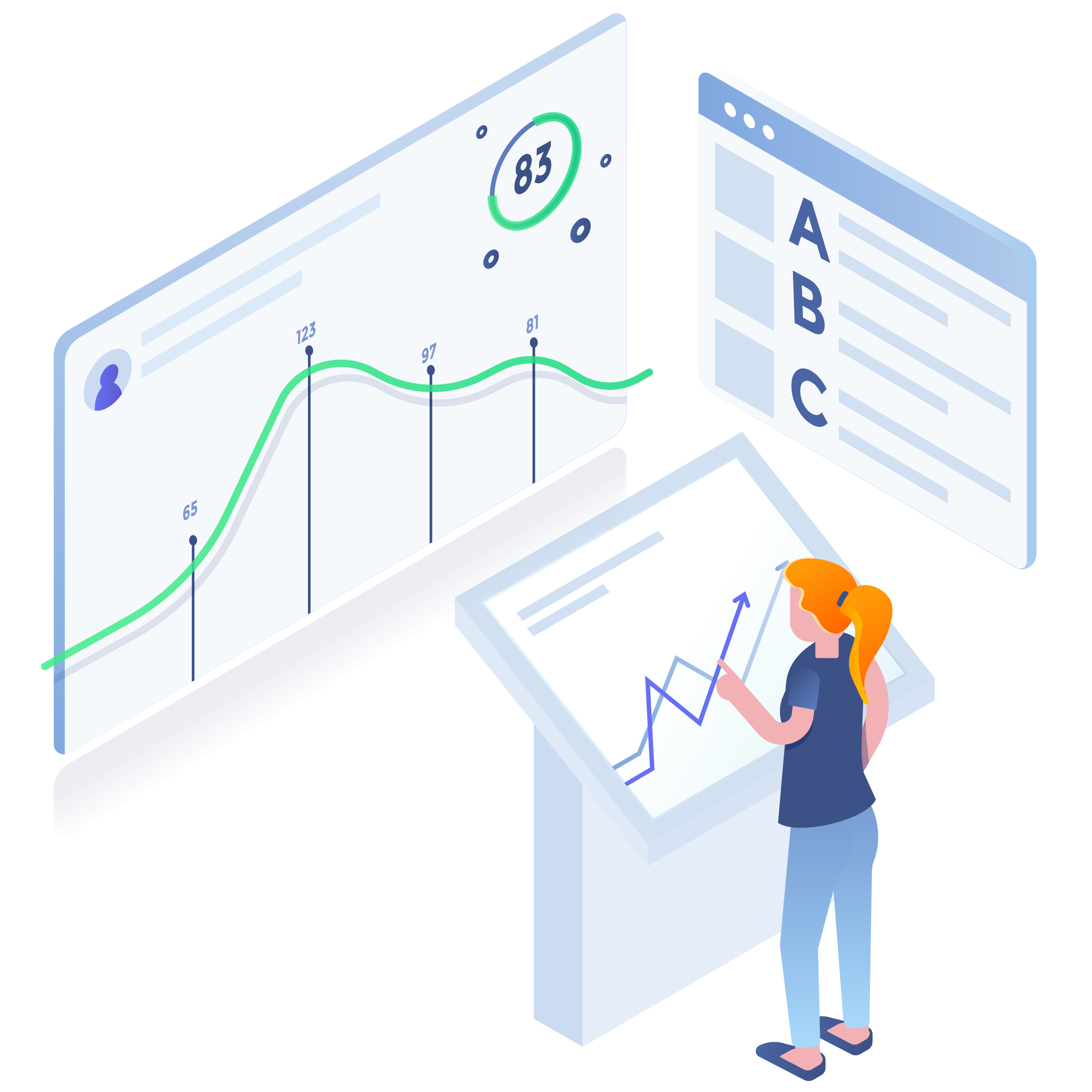
Visual insights to understand progress over time
Our technology and approach supports 360 degree visual analysis of indicator data that are assessed annually, monthly, daily, or even hourly, for any given location, be it a country, a region, district, village or a single geo-referenced point. Our solutions enable measuring country progress in meeting development goals, tracking of programmatic interventions at a hyperlocal level, assessing communities at most risk, or benchmarking local government performance.
Powerful features that reveal the journey in the data
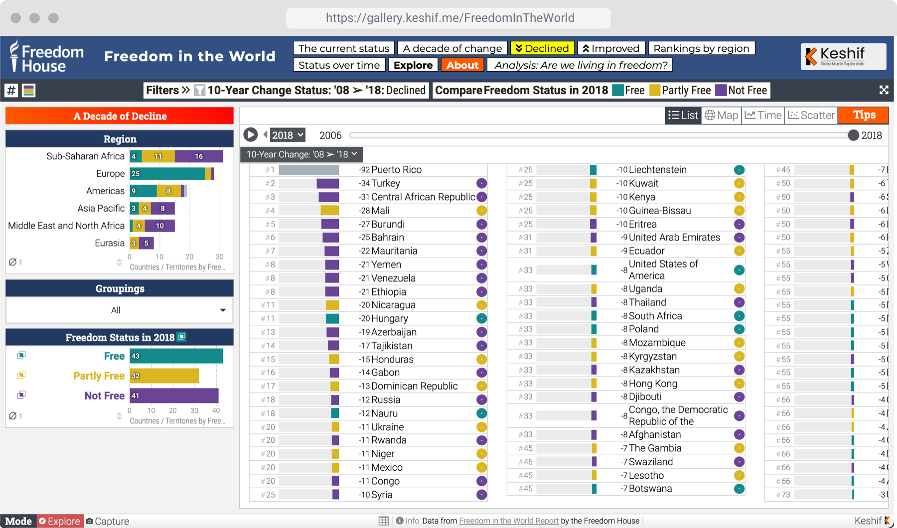
At Keshif, we have built intuitive and fully interactive charts and dashboards that go beyond presenting result snapshots for a given indicator at a given time. Our solutions enable analysts and decision makers to trace the journey of the data through many perspectives and across the full time range. They can analyze multiple indicators at once, explore changes of rankings over time, identify best and worst performers, and more.
Analyze the change and rank of locations by indicator score over time, and compare trends in changes across locations.
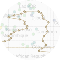
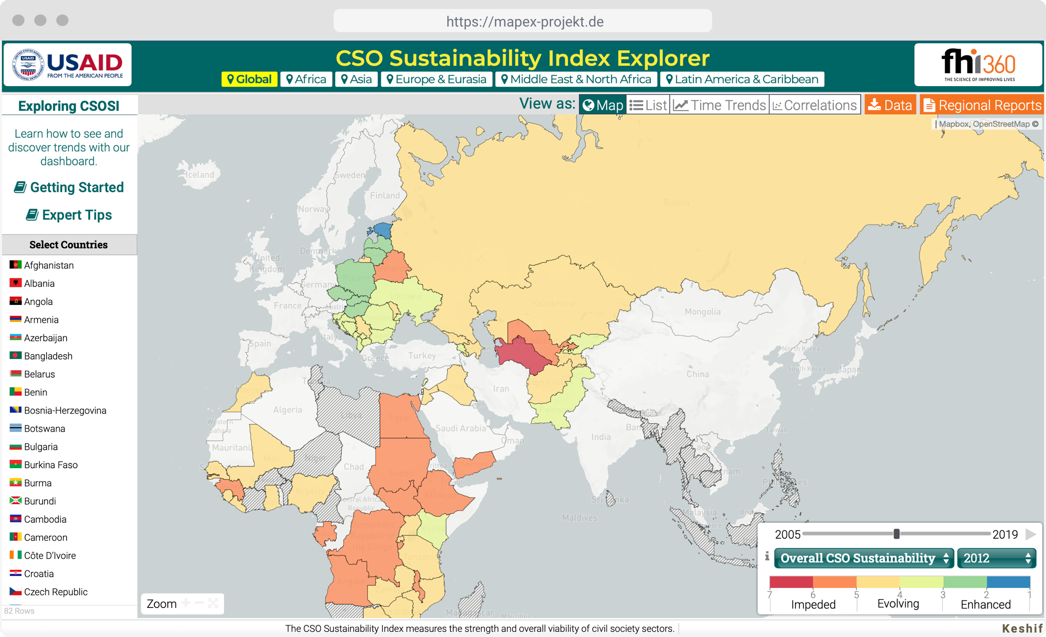
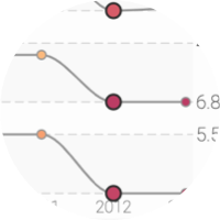
Reveal scores with interactive maps and instant interaction through sparkline tooltips that show progress over time.
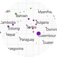
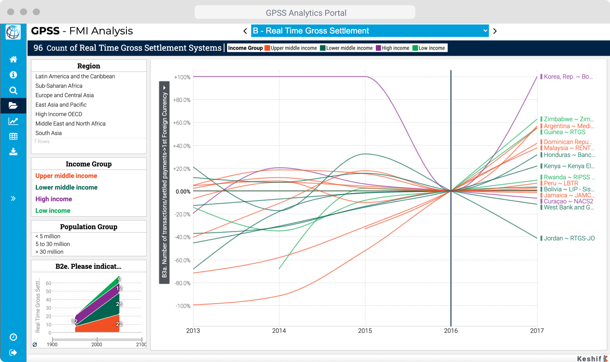
Spot trends and outliers across indicators in a scatter-plot with animated features.
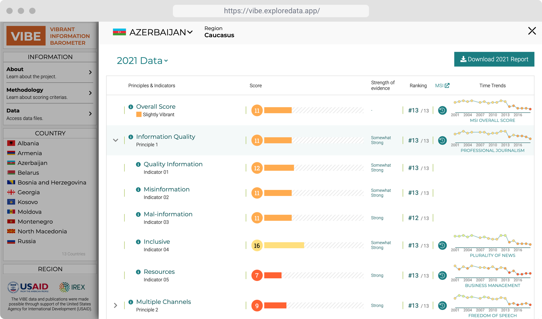
Rich location profiles that display all scores, timelines, annual rankings, year-to-year changes, and access to reports, metadata, and multimedia in one place.
Indicators anywhere, any time, any details
Our technology adopts many types of scoring methods with differing range of values and how the numbers can be interpreted.
Automated collection, processing & updates
We create digital tools for data collection and periodic updates, and create scripts to convert raw data to formats optimized for visual exploratory analysis.
Integration with existing infrastructures
Our powerful yet lightweight dashboards can easily be deployed, embedded, and securely integrate with existing platform infrastructure and databases, and hosting environments.
Access insights with public or private apps
Our secure web applications can be accessible publicly for broad dissemination, or privately for analysts working with sensitive data.
Selected Projects & Partners
View all projects
DT Global
Analyzing the Propaganda and Misinformation in Yemeni Media

World Bank
Data-Driven Website for Benchmarking Infrastructure Development

FHI360
Visualizing Civil Society Sustainability Worldwide